Additional Tips on Color and Fonts – Preparation for Creating a Logo and Infographics
Here are some additional things you should keep in mind about fonts before working with a client.
Make sure to keep the text letter characters legible. A font should not be too small so you can read it or too large so that it overwhelms the infographic or logo. Also, the more styles, a font comes in the better, but you should at least have access to the main four: regular, bold, italic, and bold italic. However, keep in mind that handwritten script fonts or special fonts may have readability issues on the screen or in print. Refer to Figure 2-64.
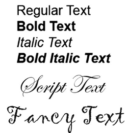
Figure 2-64. Graphics of different font families with styles of text
As you saw earlier, think about how color and readability work together. Most times, for an infographic or logo, you will stick with a font that is just going to be black or a dark color. Refer to Figure 2-65.

Figure 2-65. Logo appearing with some basic text
However, with logos, some text might be in a different color or style if it is to be on a business card or used in another multimedia project, so it is important to have options and see what works and what will not.
Yellow, light, or neon colors do not show up well on white and are better on a dark background. Refer to Figure 2-66.

Figure 2-66. Logo appearing with yellow text on a white and black background and bold text with enlarged logo
A bold italic style could give the feeling of movement, yet if too bold, it could overwhelm the graphic unless it is enlarged as well. Refer to Figure 2-46.
Dark colors are better on light-colored backgrounds. Magenta may be OK for both light and dark backgrounds, but consider whether that color is present in a current design or does it clash with the design or message you are trying to convey. This suggestion could apply to any newly added color. Refer to Figure 2-67.

Figure 2-67. Logo appearing with dark blue and magenta text on a white and black background and bold text with enlarged logo
Also ensure that the background is not patterned or at the very least a faded pattern so that the text and graphics are clearly visible. Refer to Figure 2-68.

Figure 2-68. Logo appearing with black text on a patterned and faded patterned background
In most situations with a lot of data, a solid background is best.
Note: There are other lesser-known external and internal factors that influence color perception and how your graphic will be viewed. These include
External:
•\ Exterior or interior lighting which has varying cast from red,
yellow, to blue
•\ Reflective color cast of another object, paper, pigment
•\ The camera you use to take your pictures
•\ The color mode you save your file in
Internal perceptions can be influenced by the following:
•\ Age (child and adult)
•\ Gender
•\ Personal preference
•\ Mood
•\ Cultural classification of color
•\ The era in which we currently live
If you are finished with the Adobe Color application, you can close it in the browser.
Later, in Chapter 8, we will see color harmonies again in Illustrator.