1601 AD–1800 AD – What Are Infographics?
During the 1600s–1800s, various artists continued to refine and define different ways to use the traditional map to display data on earth. Refer to Figure 1-6.
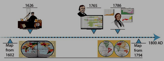
Figure 1-6. Pictorial timeline of 1601–1800 AD
Yet in the AD 1600s, the ideas of what an infographic was to appear like and what it was to represent began to change, and there were other topics on people’s minds besides earthly maps. Refer to Figure 1-7.
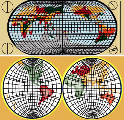
Figure 1-7. Recreation maps from the early 1600s and late 1700s
For example, in 1626, Christoph Scheiner (1573 or 1575–1650), who was a priest, physicist, and astronomer, created an infographic that involved the rotation of the sun and sunspots. This is considered one of the first modern infographics and was published in his book Rosa Ursina sive Sol. Refer to Figure 1-8.
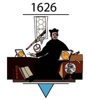
Figure 1-8. Pictorial sketch of Scheiner with his work on sunspots surrounding him
In 1765, Joseph Priestley (1773–1804), a chemist and philosopher, had created the innovation of the first timeline charts. Refer to Figure 1-9.
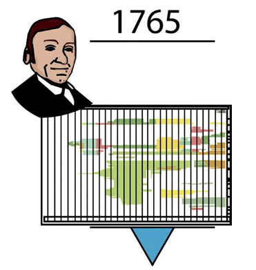
Figure 1-9. Pictorial sketch of Priestley and one of his timeline charts
In 1786, William Playfair (1759–1823) was a Scottish engineer, political economist, secret agent, and founder of graphical methods of statistics. He was inspired by Priestley’s timeline charts and, as a result, created the originals of many of the modern graphs and charts we see today. These include the line, area, and bar (column) chart of economic data. Playfair felt that a chart communicated an idea better than any data table could. Refer to Figure 1-10.
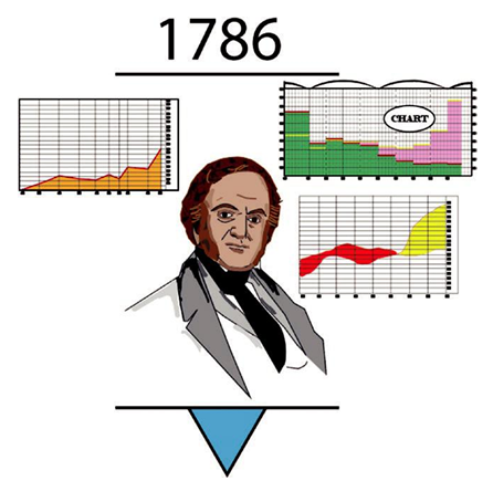
Figure 1-10. Pictorial sketch of Playfair and examples of some of his charts line, bar, and area